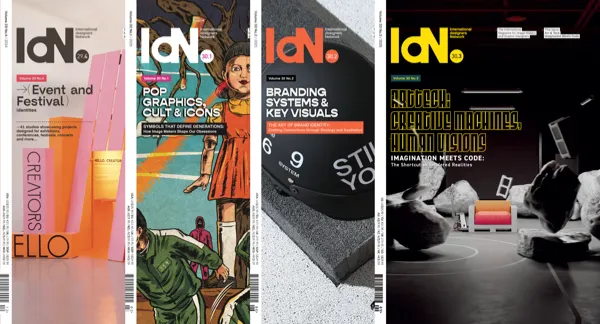
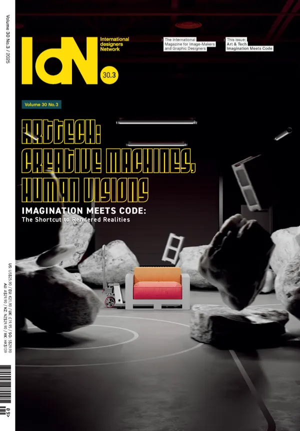
Subscribe to IdN Magazine in print

Buy Magazines
CreatorsThe who’s who of design & the industryOnair
Playing all-good visual mixtapes all-the-timePOTM
Pick of the MonthAutomat
Discovering indie designer productsImprints
A publication/print design libraryFashion
Fashion trends at a glanceArchitecture
When forms follow functionsEvents
Must-visit listing of creative eventsEducation
Educating tomorrow’s design practitionersPlaces
Directory of places for creativesHeal the World
Heal the world with visual communicationsConferences
Stellar collection of creative iconoclastsCountry
Designers’ guide to major cities worldwideJpeg
The never-ending scroll of jpegProshop
Wider creative resources for designers
Subscribe to Newsletter
Served monthly. Absolutely Free!
Served monthly. Absolutely Free!
Information
Language


